Bitcodia
Project overview
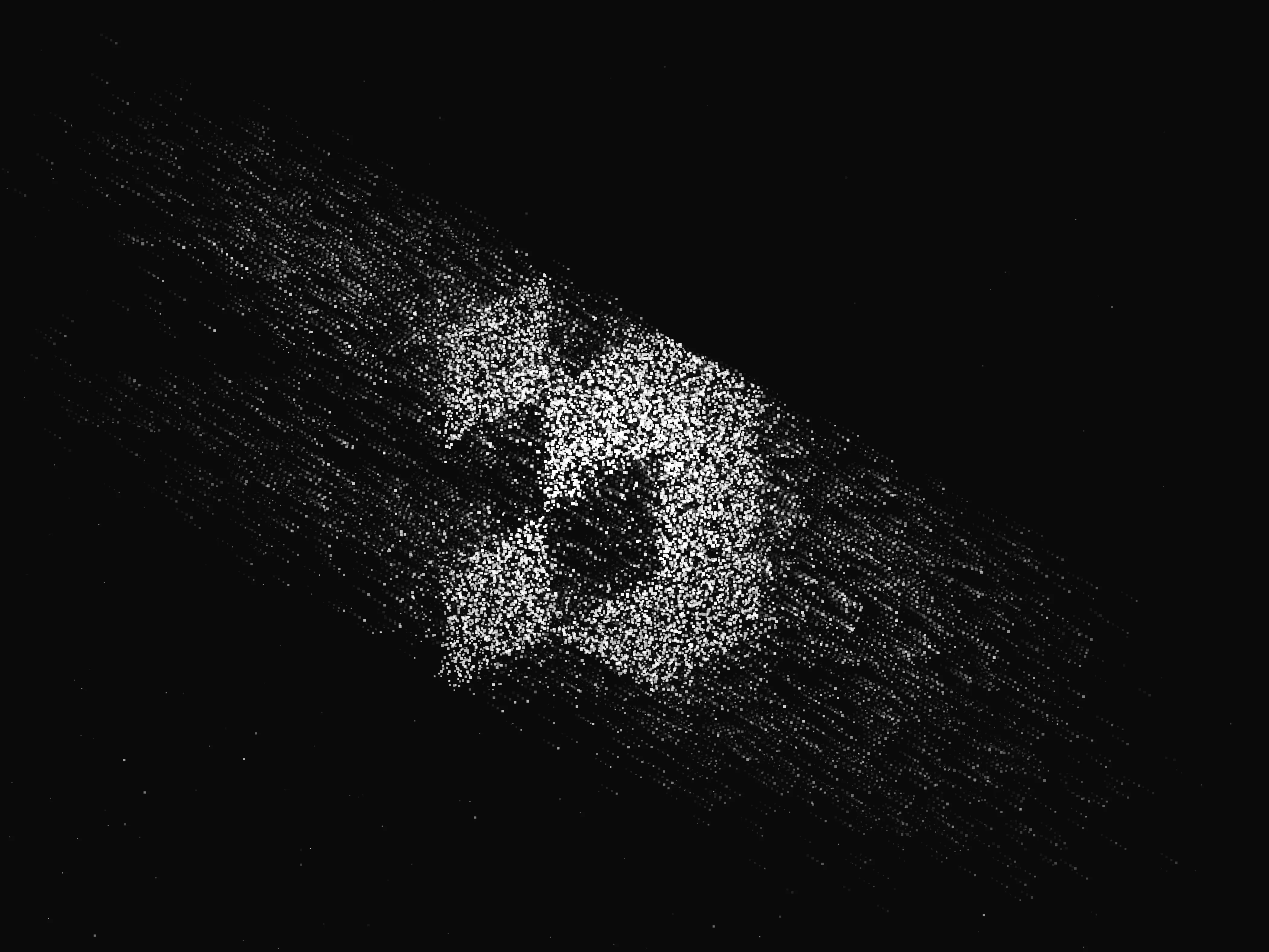
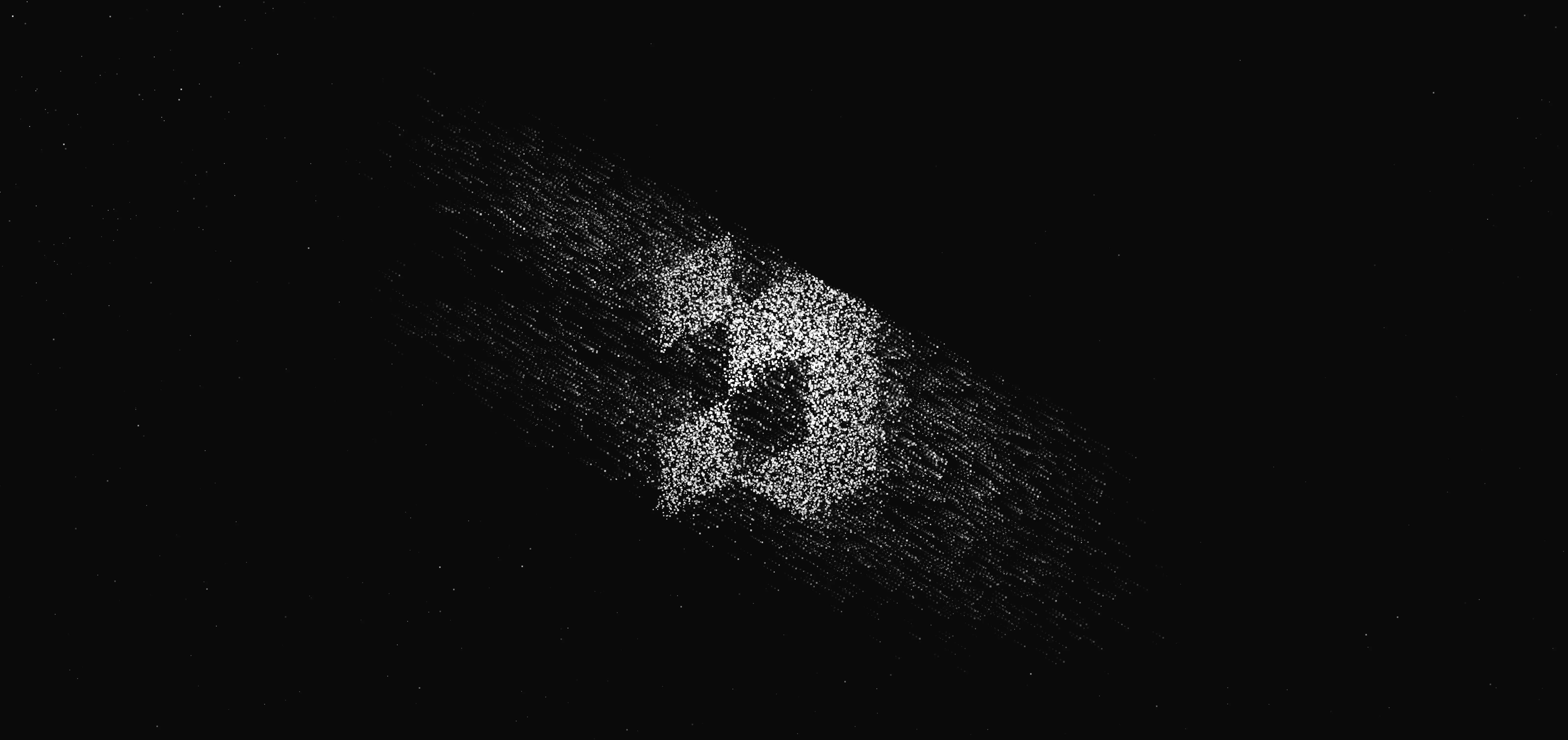
Before we started changing the digital face of our clients, we had to show what we can do ourselves. We wanted our own identity to capture who we are: a studio where precise engineering meets bold design. So our logo does not rest on complicated shapes, but on clean minimalism and the contrast that lets the technology behind it come through. We did not want a static brand locked away in graphics files, so we wired it straight into the code of the site. The logo comes alive like a living organism — we built our own generative effect, in which a chaos of digital bits and glowing stars settles smoothly into our symbol. It is a visual statement of what we do: we take raw data and code and give them a clear, elegant shape.
Bitcodia process
Monospaced font
We are a digital studio first, so we set the wordmark in a typeface built for reading and presenting code. Every letter is the same width, we reshaped the dots on the i into squares, and we added terminals that set us further apart. We finished the whole wordmark by hand, so that it reads as completely clean and professional.
An abstraction of the letter b
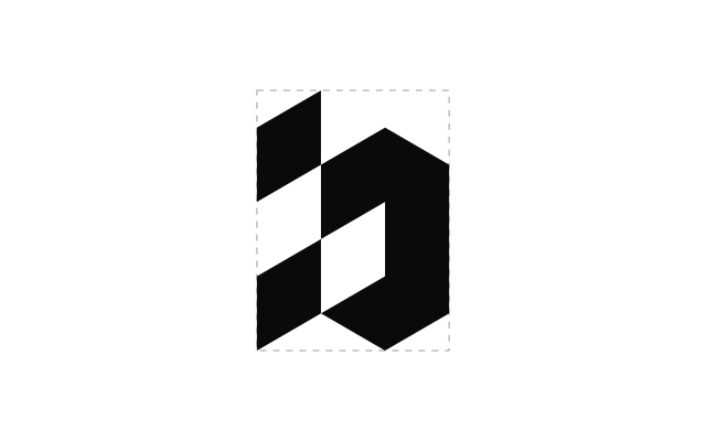
The mark itself comes out of that first letter, reworked into a minimal symbol. Instead of complicated shapes we committed to the clean geometry of angular forms. That precision and elegance is why the mark holds together beautifully at any size. The eye takes it in at once as a single strong, whole element that complements the identity of our studio.
No colour, for the clients
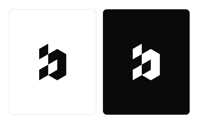
We deliberately gave ourselves no brand colour of our own. The mark works just as well on pure contrast or on inversion. We wanted it to work reliably on screen, in print, and where only a few pixels are left. Having no fixed palette gives us enormous freedom in how we use it, and at the same time it steps back naturally, to leave as much room as possible for the thing that matters most — our clients' work.
A living logo
We wanted our identity on the site to come alive at once, so we built our own generative effect for it. When you land on our homepage, a dynamic particle field greets you, where a swarm of glowing stars and cosmic dust transforms smoothly into the shape of our logo.